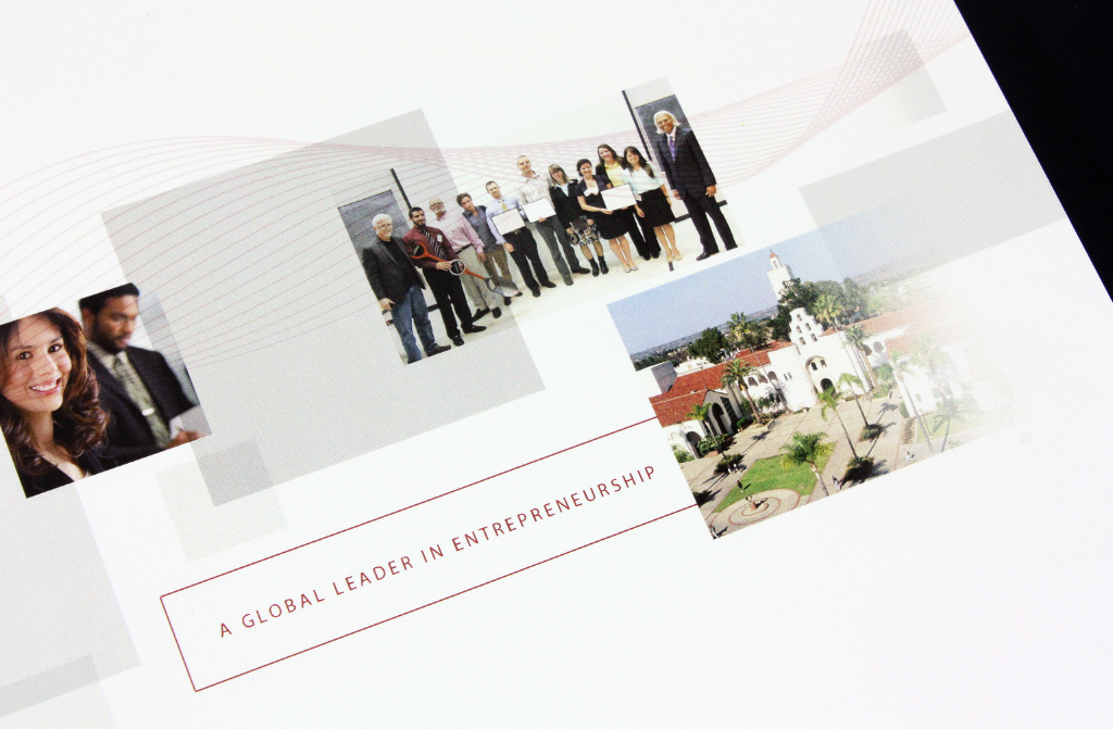
The final presentation layout was organized to allow for ample negative space. The use of white space created a very clean and professional look and also helps the reader not be overwhelmed by continuous text and content.
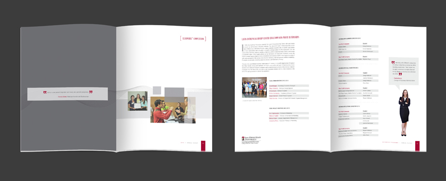
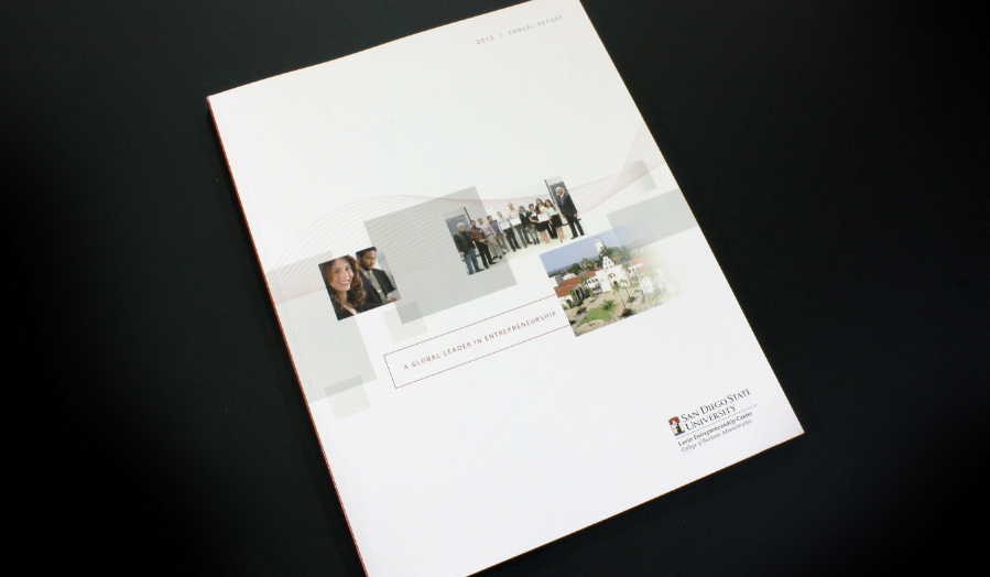
Previously, I worked as the graphic designer for the Lavin Entrepreneurship Center at San Diego State University. The Lavin Center is a great resource for all entrepreneurial-minded students on the campus. Every year, the Center releases an annual report to summarize and highlight their yearly activities and accomplishments.
The Lavin Center continues to grow and was recently remodeled. Exciting things are happening, and new guests and students visit the Center every day. To go along with the growth and development of the Lavin Center, this year, I decided to take the annual report to a whole new level. My goal was for the book to have a very clean and modern look and feel, so as not to overwhelm the reader with text.

